How to Choose Paint Colors for Your Home
- Richard Mattern
- May 4
- 6 min read
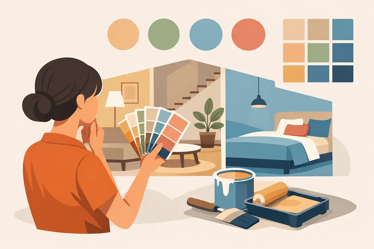
You bring home a few paint swatches, hold them up to the wall, and suddenly every beige looks pink, every gray looks blue, and the white you loved in the store feels cold at home. If you have ever wondered how to choose paint colors without second-guessing every option, you are not alone. Color can completely change the mood of a room, but the right choice usually comes from a clear process, not a lucky guess.
The good news is that choosing paint does not have to feel overwhelming. When you look at the room’s light, fixed features, purpose, and connection to the rest of the house, the decision becomes much easier. The goal is not just to pick a pretty color. It is to choose one that feels right in your home, with your furniture, and in your everyday routine.
How to Choose Paint Colors Without Guesswork
Most paint mistakes happen when homeowners choose too quickly. A color that looks perfect on a tiny sample card can feel completely different once it covers four walls. That is because paint is influenced by natural light, lamps, flooring, countertops, tile, and even the greenery outside your windows.
Start by looking at what is not changing in the room. In many homes, the hardest surfaces make the decision easier. Wood floors may pull warm or cool. Stone, brick, tile, cabinets, and countertops all have undertones that matter. If your flooring has warm golden tones, a cool icy gray on the walls may feel disconnected. If your bathroom tile leans cool, a creamy yellow-beige might fight with it.
This is where many homeowners get stuck. They pick a color in isolation instead of seeing it as part of the whole room. Paint should support the space, not compete with it.
Start with the room’s fixed elements
Before you think about trend colors or what looked great online, study the surfaces you are keeping. In a kitchen, that might mean cabinets, counters, backsplash, and flooring. In a living room, it could be the hardwood, fireplace stone, and large upholstered pieces. In a bedroom, comfort matters most, so bedding, rug colors, and light quality should carry more weight.
Try to identify whether the room feels mostly warm, mostly cool, or fairly balanced. Warm rooms often include honey wood, beige tile, cream stone, or earthy finishes. Cool rooms might have crisp whites, charcoal, gray tile, or bluish undertones in flooring. Once you know the direction, you can narrow your paint options faster and avoid shades that will always feel slightly off.
Use lighting as your reality check
Lighting changes paint more than most people expect. A north-facing room usually gets cooler, softer light, which can make grays look bluer and whites look more stark. South-facing rooms tend to have warmer, brighter light, which can soften neutrals and make warm colors glow. East-facing rooms feel brighter in the morning, while west-facing rooms become warmer later in the day.
Artificial lighting matters too. Warm bulbs can make beige, cream, and taupe feel richer. Cooler bulbs can flatten warm paint and make some whites feel clinical. That is why a color you loved in one home can look completely different in another.
If you want a dependable result, test color in the actual room and look at it several times throughout the day. Morning, afternoon, evening, and lamplight all tell a different story.
Choose paint colors based on how the room should feel
A beautiful color is only successful if it supports the way you use the space. A busy kitchen and a relaxing bedroom should not necessarily be approached the same way.
For gathering spaces like living rooms, family rooms, and kitchens, many homeowners want warmth and flexibility. Soft greiges, warm whites, muted greens, and grounded neutrals tend to work well because they feel inviting without being too theme-driven. In bedrooms, quieter colors often win because they create a restful atmosphere. That could mean a soft blue-gray, a warm off-white, a subtle green, or a muted taupe.
Bathrooms can handle a little more personality, but balance still matters. If the tile and vanity are strong visual features, the wall color should often support them rather than try to steal attention. Dining rooms, offices, and powder rooms can sometimes take deeper or moodier shades because people spend time there differently and do not always need the same airy feel as a main living area.
There is no universal best color for every room. It depends on whether you want the space to feel bright, cozy, calm, dramatic, or polished.
Think in undertones, not just color names
Paint names are not very helpful. Two colors labeled "soft white" can look completely different on the wall. The real issue is undertone.
White paint might lean yellow, pink, gray, blue, or green. Beige can pull peach, gold, or gray. Gray can look violet, blue, or green depending on the light. Even greige, which many homeowners choose as a safe middle ground, can shift warmer or cooler than expected.
When comparing colors, place samples side by side. Undertones become easier to spot when one shade is next to another. This is especially important with neutrals, because the difference between a paint that feels clean and one that feels muddy is often subtle until it is on the wall.
Sample bigger than you think you need to
A small paint chip is rarely enough. The better approach is to test large swatches on multiple walls, especially walls that get different amounts of light. If you use peel-and-stick samples or painted poster boards, move them around the room instead of relying on one spot.
This step saves money and frustration. A color that seems perfect in a bright corner may look too dark on the main wall. Another might look neutral by the window but green under overhead lights. Sampling gives you a chance to catch those shifts before the full project begins.
It also helps to limit your choices. If you test eight colors at once, they can start to blur together. Narrow your options to two or three strong contenders and compare them carefully.
Creating flow from room to room
One of the smartest ways to approach how to choose paint colors is to think beyond a single room. Most homeowners want a house that feels connected, not like each space was chosen separately without any relationship to the next.
That does not mean every room should be the same color. It means the palette should feel intentional. Repeating a warm white trim color throughout the home, using related neutrals in main living spaces, or carrying one accent tone into nearby rooms can create that sense of flow. Hallways, open floor plans, and sightlines matter most here. If you can stand in one spot and see three rooms, those colors need to work together.
This is also where restraint helps. If every room is bold, the house can start to feel visually busy. A calmer base palette often gives you more flexibility to add personality through furniture, art, textiles, and smaller accents that are easier to update later.
Do not ignore sheen and finish
Color is only part of the result. Finish changes how the color reads and how the room performs over time. Flat or matte finishes soften imperfections and create a more relaxed look, which many homeowners like in bedrooms and ceilings. Eggshell and satin are often practical for living areas because they offer a bit more durability while keeping a low-sheen appearance. Semi-gloss is common on trim, doors, and sometimes bathrooms because it is easier to clean.
The trade-off is simple. More sheen usually means more washability, but it also reflects more light and can highlight wall flaws. In older homes, that matters. A polished finish on imperfect drywall may call attention to every patch and texture change.
Trends can inspire, but they should not control the decision
Popular colors can be helpful if you are starting from scratch, but trend-forward is not always the same as timeless. A shade that looks stunning in a magazine may not suit your architecture, lighting, or furnishings. Homeowners often get the best long-term results when they use trends as inspiration rather than strict direction.
Earthy greens, warm neutrals, layered whites, and moody blues continue to appeal because they are adaptable and livable. Still, the best paint color is the one that makes your home feel more like yours. That may be classic and understated, or it may include one room with more drama and contrast.
If you are still uncertain, professional guidance can make a major difference. An experienced painting and remodeling team can look at your home as a whole, catch undertone conflicts early, and help you choose colors that fit both your style and the way you live. At A&A Painting and Remodeling, that kind of planning is part of what turns a paint job into a finished space that feels complete.
Paint has a way of changing more than walls. The right color can make a dated room feel fresh, a dark space feel more open, and a house feel more cohesive from the moment you walk in the door. Start with what your home is already telling you, trust the testing process, and give yourself permission to choose colors that feel good to live with every day.


Comments